antenna.

Leave The World Behind: Main Title Sequence + Chapter Cards

E Pluribus Unum.

As giant Mr. Robot fans, we were thrilled to be invited to create the opening titles to Sam Esmail's feature film, Leave The World Behind. Sam's adaptation of the novel, which shares its name with the film, is a wild Hitchcockian ride from start to finish. The titles kick off the ride with a bang!

  • Client: Netflix
  • Director: Sam Esmail
  • Released: December 8th, 2023

Get the brief

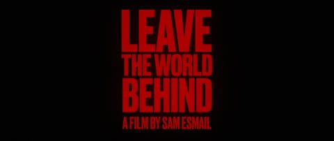
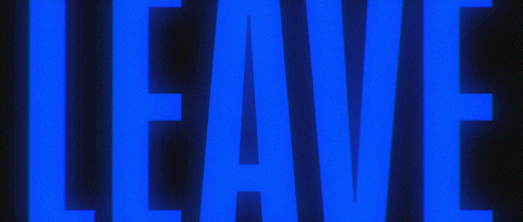
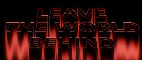
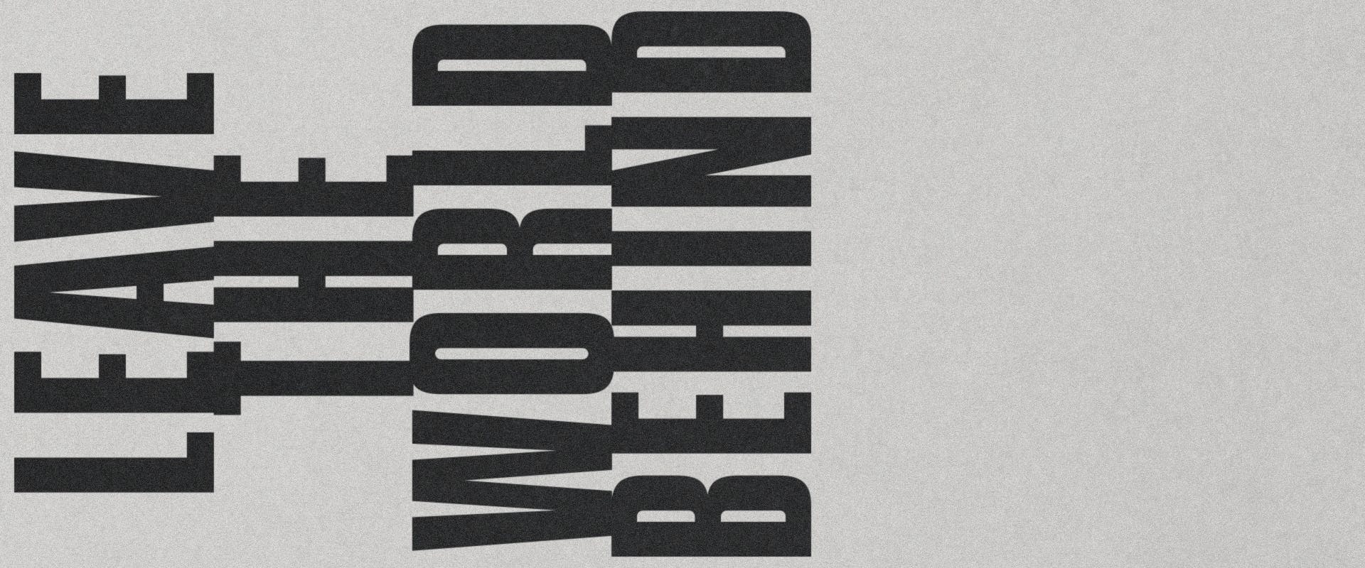
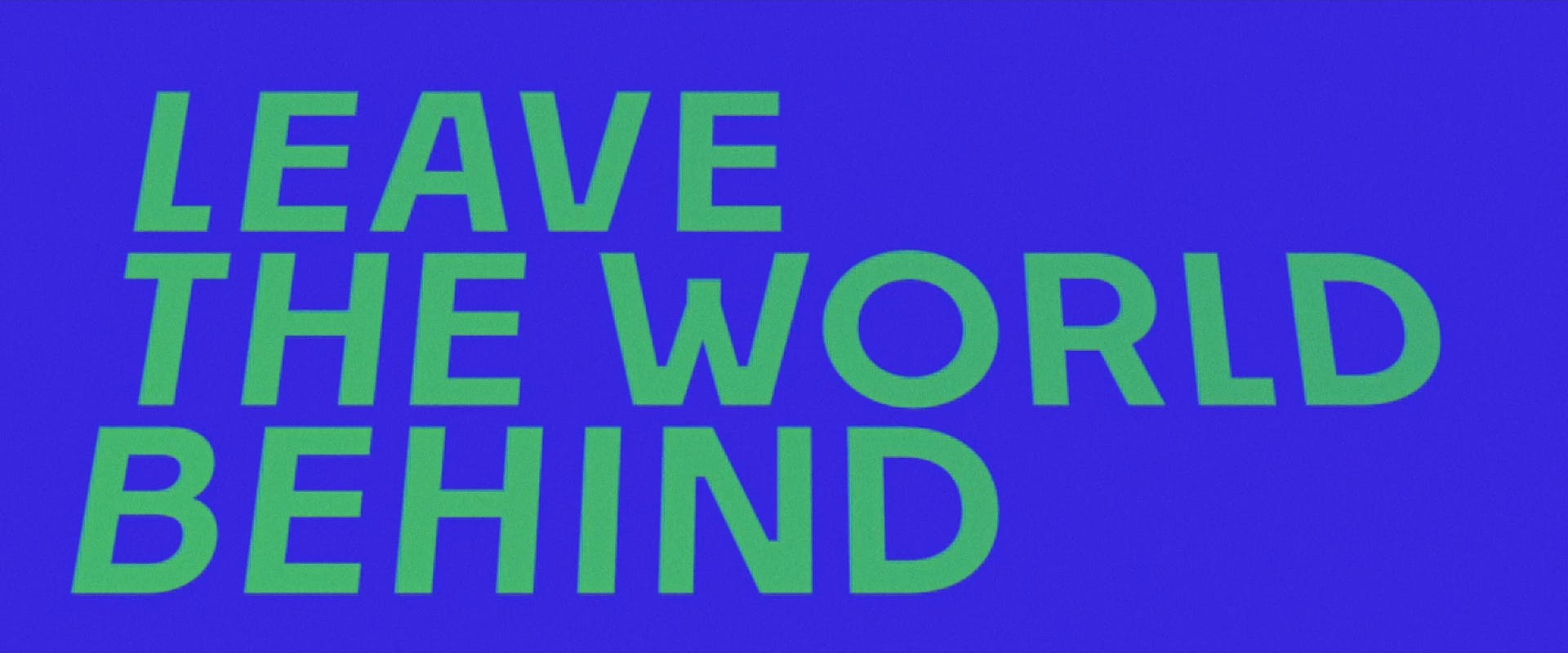
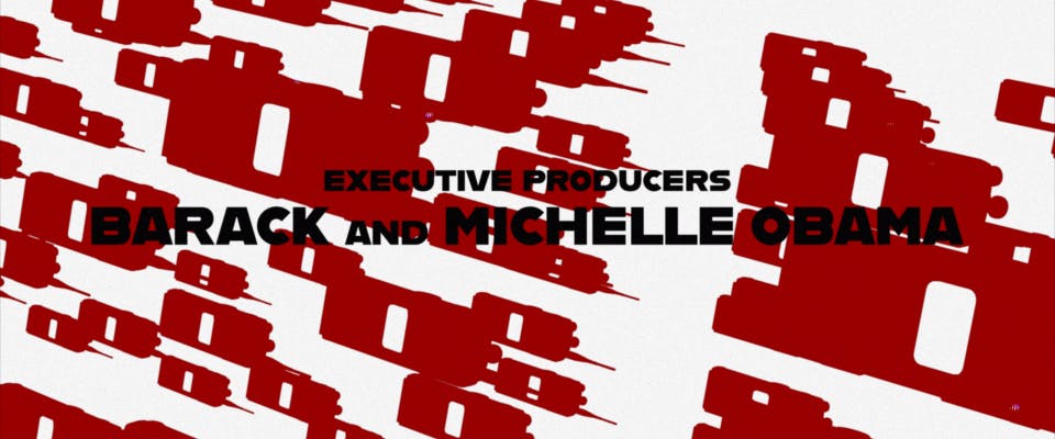
After screening an early version of the film, which already had the exact placement, timings, and music for the sequence in place (courtesy of editor Lisa Lassek), director Sam Esmail gave us a brief that left us excited, focused, and just the right amount of anxious – in other words, inspired! Essentially, much like the music track (THE REV3NGE, by Joey Bada$$), the titles needed to be bold, aggressive, and a little bit punk, promising the audience that what lay in store for them would be… well, the end-times. 

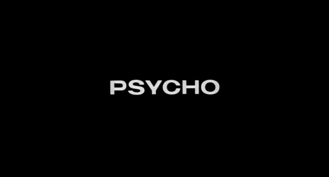
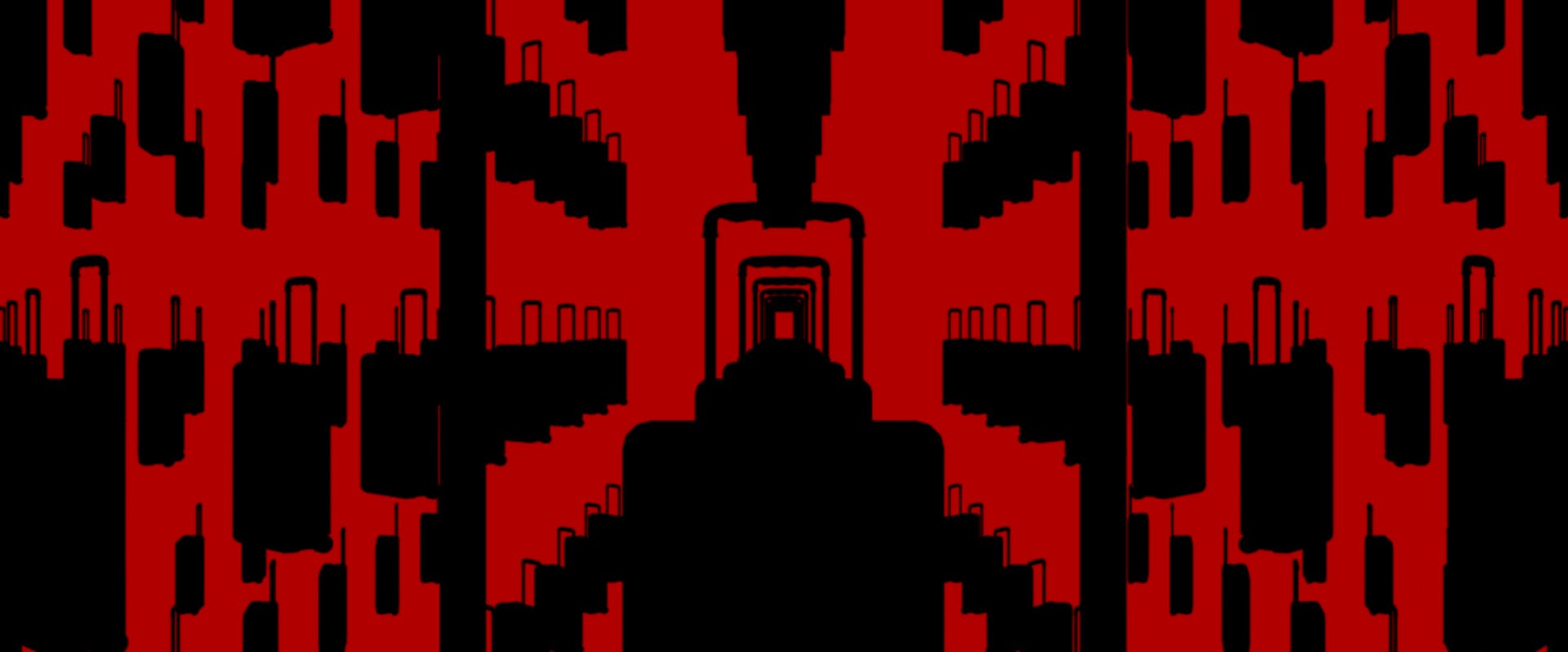
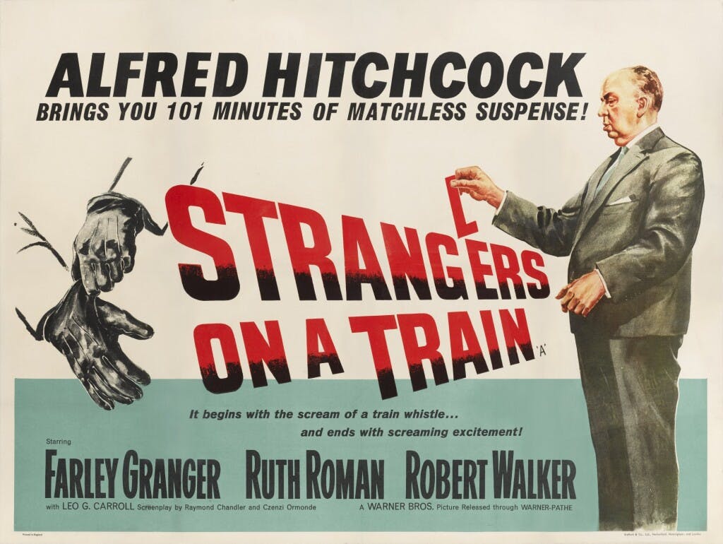
Hitchcock's philosophy was to keep characters unaware of impending harm while revealing it to the audience at the beginning of a scene, creating suspense. In essence, this title sequence is the metaphorical ‘loaded gun” we show the audience at the beginning of the film.

Jarik van Sluijs, Creative Director

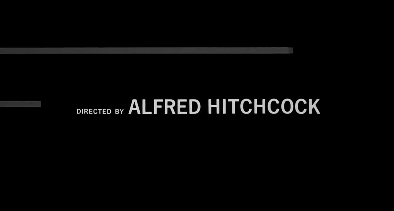
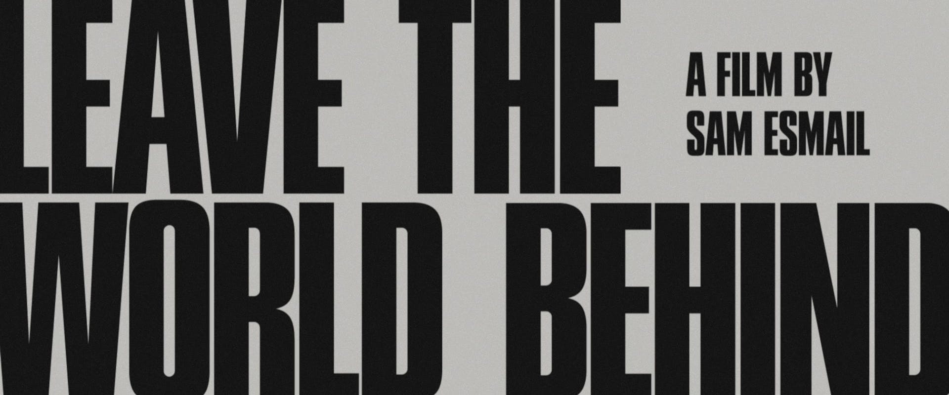
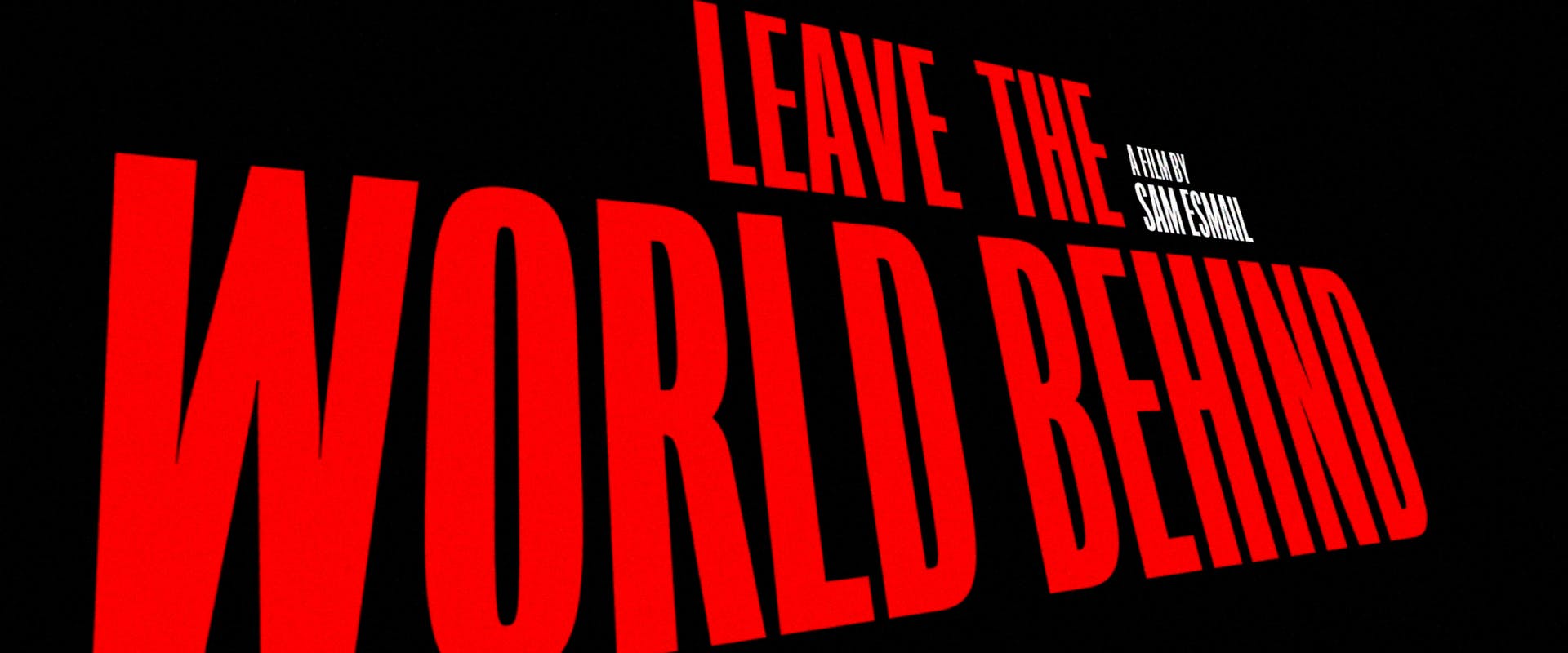
Oh yes, naturally, Saul Bass came up.

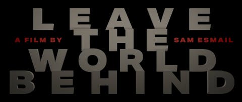
With a film that is heavily influenced by the work of Alfred Hitchcock and, in some cases, pays direct homage to scenes and shots from films such as North By Northwest, Psycho, and Strangers on a Train, you can't be surprised when the director mentions Saul Bass' work. That said, as a designer, you usually need to be careful when directly referencing Bass' work, lest it devolve into full-on plagiarism. However, this film, more than any other we've worked on, gave us permission to explore and touch upon Bass' work in the same way the film touches upon Hitchcock's. 

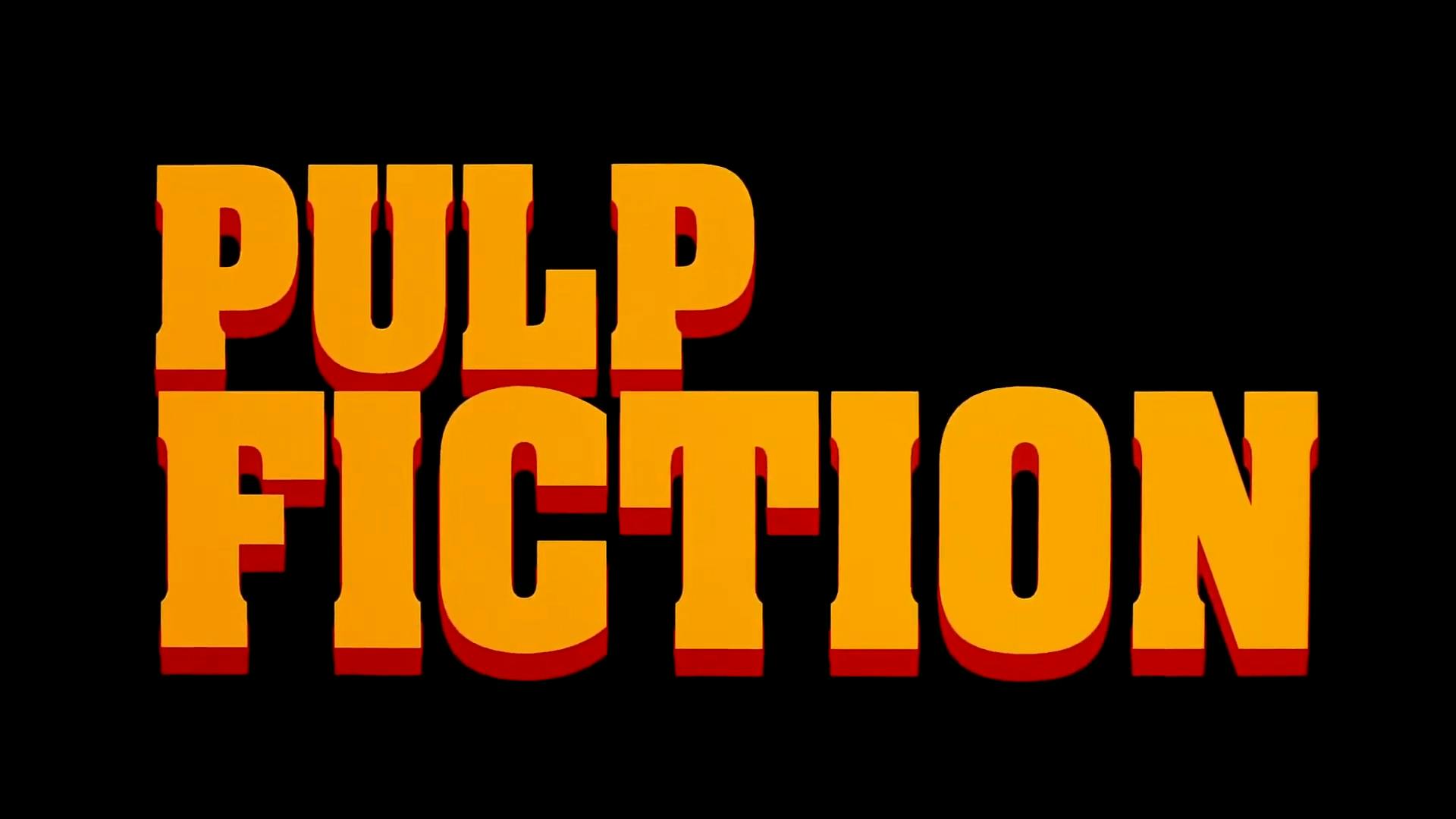
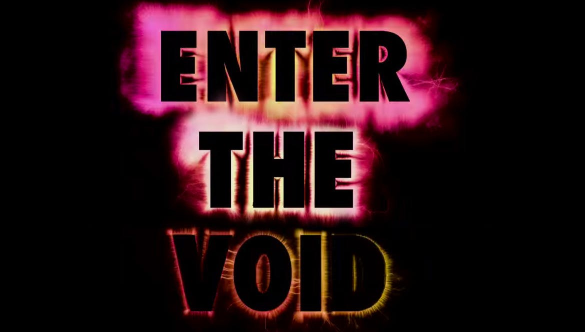
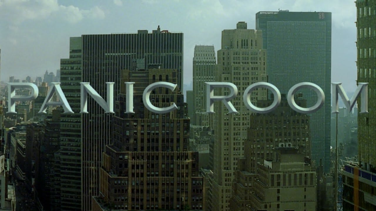
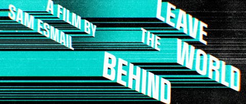
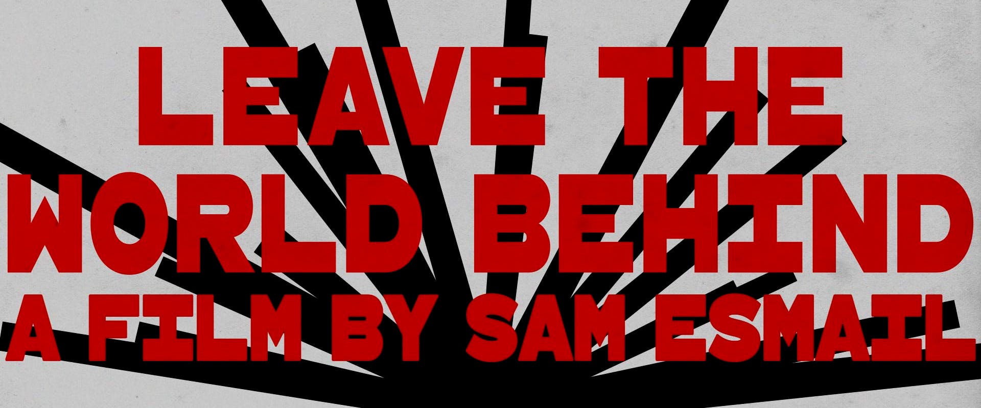
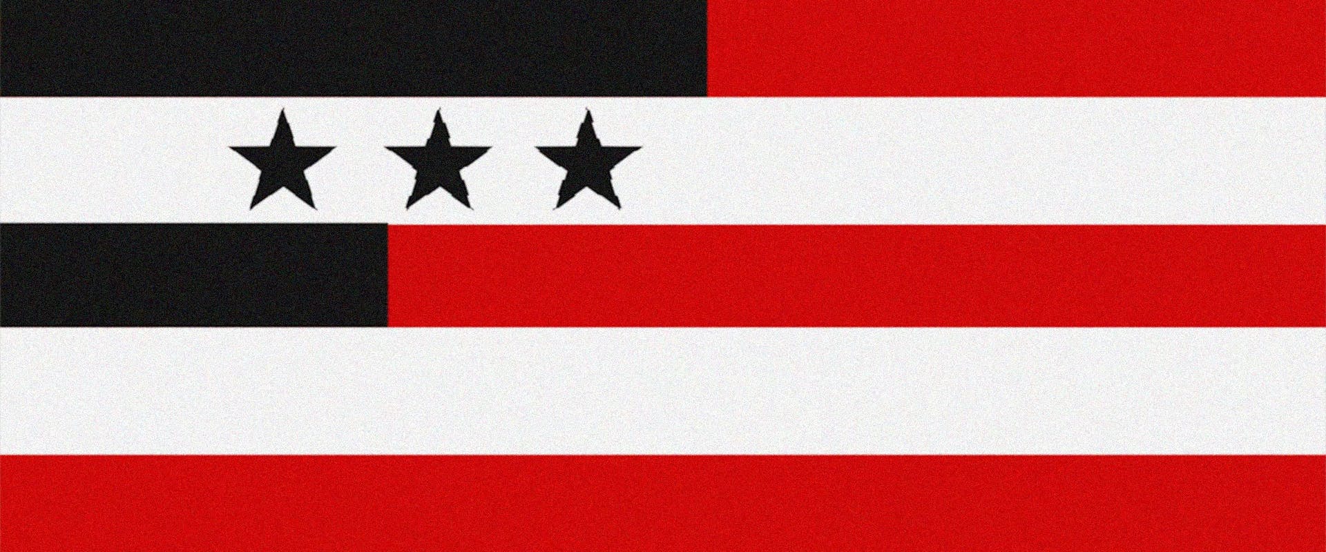
The titles of three other films also came up: Pulp Fiction, Enter The Void, and Panic Room (Itself an homage to the titles of Hitchcock's North by Northwest). They were all instructive in how we dealt with the title card, its size, and its sense of perspective.

Trust the process

The stock market, animal migrations, airplane routes – if one word immediately stood out to us after the first screening, it was PATTERNS. Mahershala Ali's character at one point even says, "In my line of work, you have to understand the patterns that govern the world. You have to learn how to read the curve. Spend as long as I have doing it, and it can help you see the future". The other two words recurring in our brainstorming sessions were ALARM and NOISE. 

With those three concepts in mind, we started our exploration.

Presentation 1

Our first presentation included four concepts that would become the building blocks of the final sequence. 

Concept: Alarm V1

A sequence of individual shots cut to the beat of the music consisting of the silhouettes of objects in 3D space aligned in arrays and grids forming patterns. As the camera orbits around them, hinting at the cyber-attack central to the film, the objects cut in and out of low-resolution versions of themselves – if a square pixel is the building block of a 2D bitmap image, then the 3D equivalent would be a cube. These cube objects are abstract, obscure, and sometimes misguide their true identity. The color effects are a visual representation of the disorienting noise that occurs in the film, predominantly blue.

Concept: Bars V1

A direct homage in shape and animation to Saul Bass' seminal titles for Alfred Hitchcock's PSYCHO. We also generated a less abstract ALT version.

Concept: Pattern V1

Another homage to Saul Bass in the shape of an ever-evolving sequence that starts and ends with a simple graphic shape, a line. We visit moments in the film in an abstract manner, continually revealing different types of patterns – natural, financial, geographic, aural, technological, etc. 

Concept: Mrs. Robot :) V1

A remix of the ALARM concept, this sequence reveals hints of shapes and images through a pattern created w/ ASCII code, this secondary layer of patterns represents a hacker's POV of different events in the world.

Presentation 2

Our second presentation consisted of further developed versions of the four concepts Sam Esmail was gravitating towards. All four gained more storytelling elements and allowed us to show the different animation styles we envisioned for them. 

Concept: Alarm V2

Concept: Bars V2

Concept: Pattern V2

Concept: Mrs. Robot V2

At this point, the MRS. ROBOT concept was deemed too extreme, and dropped out of contention, but the remaining three concepts were in the running!

Presentation 3

We decided that we could consolidate three of the concepts into one "COMBO" concept based on what aspects of each resonated the most with the filmmakers. However, we continued developing the ALARM concept further, taking valuable input from Sam and his team.

Concept: Alarm V3

Concept: Combo

Finish it

The reaction to these two directions was very positive, which meant we had a problem: We still had two completely separate sequences and only one movie to attach them to! Together with Sam Esmail, we found ways to incorporate his favorite aspects and moments from the COMBO concept back into the ALARM sequence, and in the process, gave it a new ending consisting of the kinetic sound wave animations as well as a new transition to the next scene of the film.

By continually cross-pollinating concepts throughout the process, we could fully explore, distill, and exhaust multiple ideas in different directions while still arriving at what we feel is the most complete, sincere, and authentic (for lack of better words) version of the sequence. Towards the end, the sequence started to get a life of its own, and it was able to tell us what fit and what didn't. We are very proud of the final result's clear style and visual economy. We knew we would never be able to match the iconic work of Saul Bass, but it did help to have it as our North Star.

Sam Esmail is one of those rare auteur-directors, and his vision, attention to detail, and guidance ensured that the titles would fit the world he had built with the film.

– Caroline Kopesky, Art Director

In the meantime: The Main Title card

All the while, we worked on the Main Title Card typography, design, and animation.  An entirely separate evolution happening in parallel to the rest of the sequence, that would eventually be incorporated into the final.

It was vital to Sam that the title felt massive on screen. We went through dozens of typefaces throughout the design process, but we just couldn’t find the perfect fit. Early on in the process, we received a custom typeface created for the film, but unfortunately, it only came in one weight, and it was far too thin to achieve the screen presence we were looking for, so we made our own custom extra bold version of the typeface specifically for the title.

– Lucas Christman, Creative Director

Alfred Hitchcock's Strangers On A Train served as inspiration

The last step: Chapter cards

The editorial team came to us with chapter cards already placed, so it was our job to integrate them into the visual style we'd developed for the film. For these, we used the font that had been provided before the customization occured, adjusted some kerning, and experimented with placement techniques.

And finally, a little trivia: Presentation cards

Did you know that the presentation cards at the head of the film mimic those of the Mr. Robot titles?

Title sequences are sadly kind of a lost art. If you go back to Hitchcock, the title sequences are classic pieces of art on their own. For me, our title sequence drops the gauntlet and says, “Enjoy the ride, strap in, because what you’re about to see is maybe not what you’re expecting."

Sam Esmail, Director

(Owen Meyers, "Leave the World Behind" Book to Screen, December 12, 2023)